Table of Contents
Introduction To Reading Price Charts Bar By Bar
Unlocking the secrets of successful trading often hinges on one’s ability to decipher the intricate language of price action. In the world of traders, mastering the art of reading price charts bar by bar and recognizing the nuance of identifying a price action bar pattern can be the key to navigating the complex terrain of price movements.
In this article, we will delve into the significance of these crucial skills and explore two distinctive types of bars: “Key Bars” and “Solos.” These candlestick patterns hold the power to elevate your trading acumen and enable you to make well-informed decisions amidst the chaos of financial markets. Let’s embark on a journey to understand the intricacies of these patterns and their role in the ever-evolving world of trading.
What is The Price Action Bar Pattern: Key Bar?
Let’s kick off with the concept of a “Key Bar.” This is a feature that gained prominence recently, and for a good reason. When reading price charts bar by bar, Key Bars are the stars of the show on your price chart – they stand out, and they demand your attention.
These bars exhibit distinct characteristics that set them apart. We identify them by a better-than-average range, tails and wicks are noticeably smaller in relation to the body of the candle, and most importantly, relatively high trading volume. These are all telltale signs that buyers or sellers are active.
However, it’s crucial to remember that Key Bars should not be used in isolation. Like any tool in your trading arsenal, they are most effective when combined with other technical analysis techniques. To illustrate how they can be integrated into a trading system, let’s consider a simple and mechanical approach:
Using Key Bars in Your Trading System
When a Key Bar appears on your chart, it’s represented as a hollow candle. If this Key Bar is green, it’s a signal to go long. As long as the open of the Key Bar is intact, we stay long. If the open from the original green Key Bar has not been breached and we get a second green Key Bar, we move the pivot up to the open of the second green Key Bar. This acts as a trailing stop.
The idea is that a green Key Bar is a sign of strong buying at that level (the open of the bar) and that is a sign of support. We expect it to hold. Buyers were there previously and if that level is tested in the future, we want to know that buyers are still there. If that support fails, the bid has been “cleared” and sellers are in control.
If the open of the green Key Bar is breached and we close below it, we pivot (exit the long and go short). On a fail, we stay short and we use the open of that green Key Bar as our pivot.
If a green Key Bar is followed by a red Key Bar, we pivot (exit the long and go short). We use the open of that red Key Bar as our pivot. Then we follow the same logic. When we have new red Key Bars, we move the stop down to the open of the most recent red Key Bar.
A close above the open of a red Key Bar or a green Key Bar would prompt us to pivot.
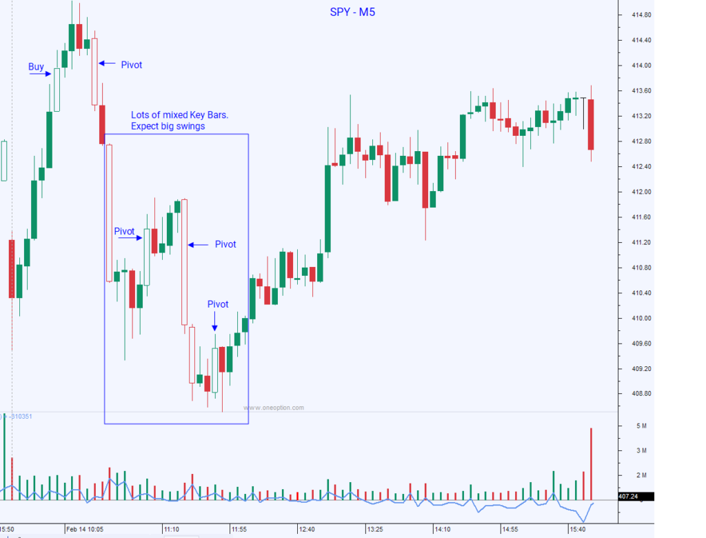
When we see two or more mixed Key Bars in a 30 minute period it is a sign of volatility and we should expect big swings. This is a binary (always long or short) system and it has limitations as a price action bar pattern. Let’s look at some charts.
Interested In Learning More?
Expand your knowledge around reading price charts bar by bar
Key Bars in Action
To better understand how Key Bars operate, let’s examine some real-world examples when reading price charts bar by bar.
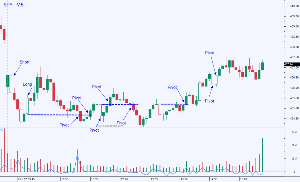
In the chart below, you will see the entries and exits. Let me save you some time, The System lost money on this day. “Pete, these Key Bars suck.” That would be the normal reaction. However, most of you are much smarter than that because you have recognized the tight trading range, the mixed overlapping candles price action bar pattern and the lack of market direction. This is a low probability trading day and most indicators or systems (except for scalping systems) will fail under these conditions. Again, these bars and this system were designed for confirmation and to serve as a visual aid when you are looking at charts.
Volatility and Trend Strength
In the next chart The System made money. The first moves probably broke even and then the final pivot did very well. I picked this because of the example it shows for reading price charts bar by bar, not because it made money. These mixed Key Bars that appeared in a short period of time signaled volatile conditions so we should have expected big moves. The volume was also heavy and that was a sign that eventually one side would prevail and that there would be a sustained move.
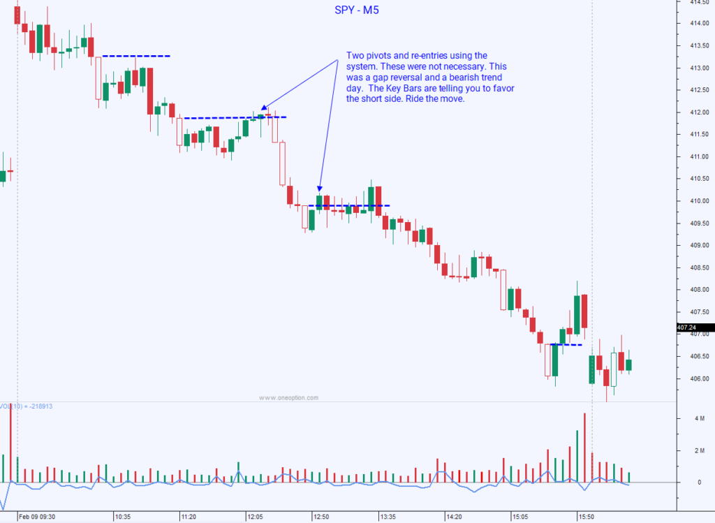
In the next reading price charts bar by bar example, the market gaps up and we have a gap fill. The first red Key Bar tells us that a fill is possible. Later we see the additional red Key Bars price action bar pattern. They confirm the direction and now it looks like we could have a nasty Gap Reversal and a bearish trend day. The system would have prompted you to pivot twice. This was unnecessary. The down trend was strong and we should expect bounces along the way. This is another example where the information provided by the Key Bars is more important than devising a trading system around them.
Understanding Mixed Key Bars
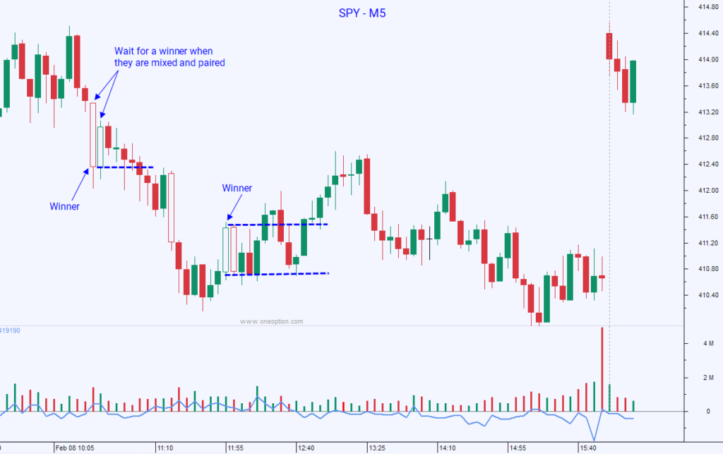
In the chart below, we see two consecutive mixed Key Bars. This price action bar pattern is a sign of opposing forces. Sit back and wait for a victor. We can see that in general, the price action on this particular day was very choppy with mixed overlapping candles. That told us that the trend is weak. Trim your size and go into “hit and run” mode while reading price charts bar by bar.
Key Bars at Relative Highs and Lows
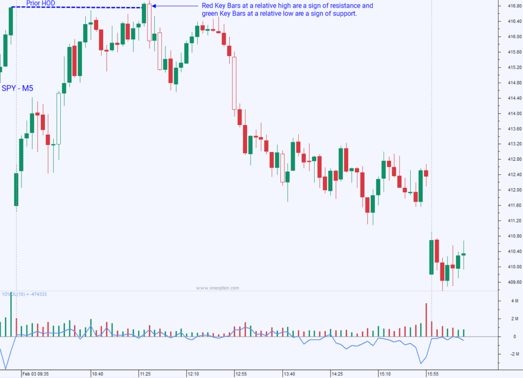
When a Key Bar price action bar pattern appears at a relative high they are important. We want to attack that resistance and a green Key Bar tells us the breakout could be legitimate. A red Key Bar at a relative high tells us that resistance is stiff and that this could be a short-term top. That was the case in the chart below. When reading price charts bar by bar, that warning sign near the prior HOD alerted us. When the double top lower high surfaced, we knew it was time to short. When a Key Bar appears at a relative low, it is significant.
If it is red, we are attacking the low with gusto. That is what we want and that breakdown has a good chance of being legitimate. When we see a green Key Bar at a relative low, that is a sign of support. We should expect a bounce and perhaps even a trend reversal. The price action during the day is also important heading into that relative low. If the trend lower has been strong and if it is red, this is probably the start of the next leg lower.
If the candles are tiny and they have tails, we know that support is forming near the low and a green Key Bar signals that a bounce might be coming. We can’t just jump on these Key Bars at relative highs and lows because they could be “Solos”. Let’s talk about those next.
Interested In Learning More?
Price Action Bar Pattern: Solos
“Solos” are a single long candle price action bar pattern (typically engulfing candles) that often shake traders out of a position. Sometimes they are Key Bars, but not always. They are critically important to identify and we see them at relative highs and relative lows. They are common during a strong trend and particularly after a big move in the direction of the trend.
Recognizing Trend Strength with “Solos”
Let’s focus on the short side knowing that the same concept applies on the long side. Big moves down will eventually attract buyers. Sellers will be less aggressive at those lower levels and shorts will be a little more anxious to lock in gains. We might notice candles start to compress and the bodies become tiny when reading price charts bar by bar. This is a classic sign that we might see a green “Solo”. These candles look like the “real deal” and they are long.
As long as we only see one candle (hence the term solo), we have to patiently wait to see what happens next. If we see two stacked green candles consecutively, it is a sign of support and we need to prepare to take gains on shorts. This is more than a short covering bounce and buyers are interested. How the @#$% do we know that? If sellers were aggressive, there would be offers layered higher and you would never stack two “greens” consecutively.
If you have a “Solo” price action bar pattern followed by a doji and then you get another green candle, you also need to take gains on shorts. Buyers are aggressive enough to lift the “ask”. It is a sign that sellers are not that aggressive and that buyers are. They key to a green solo in a strong down trend is that it will be hammered down in the next 3-5 bars (or less).
Avoiding the Bull Trap
The novice trader assumes that all bullish engulfing candles (some are Key Bars) at a relative low are a sign of a trend reversal. They panic out of their shorts because they just “lost” a nice chunk of their gains on that “stupid green candle”. The “seasoned novice” knows better than to get long. They know to wait for confirmation so they avoid the pending bull trap.
The novice trader makes a classic error. They start believing that this green candle is the start of a trend reversal and they get long. “Buy low and sell high. I am going to make a killing when this market recovers.” In a matter of 2-3 bars, that “Solo” price action bar pattern gets hammered down like a nail through balsa wood. The novice trader gets their head handed to them. As the down trend resumes with a vengeance they puke their long position along with every other novice and the next leg lower accelerates.
The “seasoned novice” complains that they need to “be more patient” and that they need to “let their trades run”. WRONG! Many of these will lead to reversals. The trader needs to be more proficient at recognizing trend strength. They got completely whipsawed out of a great short position and they left a ton of money on the table.
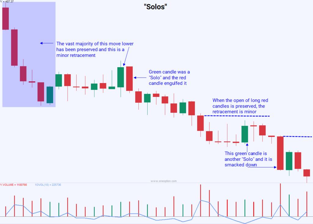
So how do we know? The price action bar pattern heading into the “Solo” is critical. If the selling has been steady with stacked red candles like the ones in the chart above, sellers are aggressive. We need to look for all of the signs I’ve been teaching you with regards to trend strength.
In the chart above, notice how the retracements are minor and the volume is good. When we have a strong trend lower, put your “big boy” pants on and welcome these “Solos”. By reading price charts bar by bar, they will confirm that you are on the right side and they will lead to the next leg lower. Often, you won’t get that next move lower until you see a “Solo”. As long as it is only one candle, you can add to shorts when that long green candle is quickly hammered down in the next few bars.
Dip buyers are going to get crushed and bail. Profit takers who covered their shorts on that “Solo” price action bar pattern are going to regret getting out and they are going to re-establish short positions. Both of these actions are bearish and you can rejoice knowing that you recognized the trend strength and that you stayed the course. This is next level stuff and when you hit this point you are on your way to becoming a good trader.
If the trend strength has featured mixed overlapping candles price action bar pattern on light volume, we should expect that an engulfing candle is NOT a “Solo”. It is imperative that you know the characteristics of a strong trend and a weak trend. In the previous chart above we have a weak rally. That “Bearish Engulfing” candle off of the high of the day is NOT likely to be a “Solo”. It is likely warning us of a trend reversal and a move down.
Conclusion To Reading Price Charts Bar By Bar
Mastering the art of “Reading Price Charts Bar By Bar” with the help of Key Bars and “Solos” can be a game-changer for traders. They were developed more as a visual aid than as a trading system. That said, we know that these bars are meaningful because one side was able to move the needle and they did it on decent volume.
Key Bars should be used for confirmation and they should be used with other technical analysis and other technical indicators. They will be added to Custom Search and they will be a valuable search variable. Key Bars can be used on any time frame and they are equally relevant on a daily chart. Follow the direction of the Key Bar and use the open of that Key Bar as a stop or a pivot.
Continue learning about Calendar Spreads or trading Earnings Season.


